Color Theory in Home Design
- Home Transformations Blogspot & More...

- Jun 12
- 3 min read
If you’re excited to change up the look of your home, color helps to make one of the strongest statements you can make within the walls of your home. Have you ever looked at an interior design and thought something was off about it, but you couldn’t quite identify what it was? Color theory may help us understand what exactly your eyes caught.
If you’ve ever asked what colors belong in your home, we’ve got a brief guide to explain what you need to know! Read on to find out more.
Color Basics
One of the first things to consider when choosing colors is in regards to tone and temperature. Warm colors, such as red, orange and pink will give the house a more energetic feel, while cooler colors will lend a more relaxed, casual atmosphere. There are various ways to combine colors within a room, but the two methods we’ve found that work best are triadic and analogous. Those words sound complicated, but it’s not as bad as it sounds! It helps to look at the color wheel.

The terms don’t indicate what colors to pick, but if there’s a color you have your heart set on, it will help you choose what other colors to choose for accent.
Analogous simply means choosing a set of three colors that are close to one another. For example, if you wanted to use violet, you might want to make the trim red violet and the accents blue violet, or vice versa.
Triadic, on the other hand, emphasizes a blend of colors that are spread out from one another in such a way that the colors are evenly spread from one another. For example, if you had chosen violet as the main color, you may use shades of green and orange as the accent and trim colors. Keep in mind, it’s generally best to not use the strongest shade of each color, but this choice is up to you, of course.
Balance Your Colors
Once you’ve chosen your colors, it’s important to know how to use them. Balancing your colors correctly is as important as the colors you’ve chosen, as having an overwhelming amount of one color can throw off the composition of the room. You want the main color of the room to be your primary paint color, as there’s no way to avoid that color within the room. Beyond that, your secondary color pieces (carpets, decorations, etc.) will occupy another slot within the color composition. Furniture and rugs will usually take up the last bit. Ideally, these will balance out to a mix of approximately 60% main color, 30% secondary color, 10% accent color. If you're looking to sell a house, but it doesn't seem to be fitting this dynamic ratio, take a look at what we can do for you personally at https://www.hometransformationsstaging.com/why-staging and we'd be more than happy to help you apply these concepts!
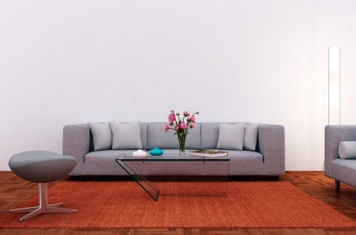
This photo is a solid example, as the walls, furniture, and floor are different colors, but they create a nice blend of colors by sticking to the rules. The floor takes up about 30% of the available space, while the wall color takes up about 60% of the space. The furniture is another color yet, taking up about 10% of the space, and bringing a further pop of color to the room.
Seeing all of this written out is helpful, but the best way to learn more about it is by playing with colors for yourself. A great free resource we found can be at https://color.adobe.com/ and it’s great for experimenting with color combinations. Play around, find your favorite combinations, and see if there’s any ways to link it back to your own home!
If you want a professional’s help with getting your space up to par, check us out on Facebook at https://www.facebook.com/HomeTransformationsStaging to see what we’re up to these days, and shoot us a message if you’d like to work with us!

#Homestager#mercercountypa#grovecitypa#neshannockpa#slipperyrockpa#hermitagepa#lakelatonkapa#grovecityrealty#homestagingresources#GCChamberpa#thepreferredrealty#beforeandafter @ryanbibzagroup @yourpittsburghhome @jenreillyrealtor @hazy_construction @Hometransformationsstaging #howardhanna @maureendifeo
Comments